Saturday, 5 November 2011

Main Task: Double Page FINAL

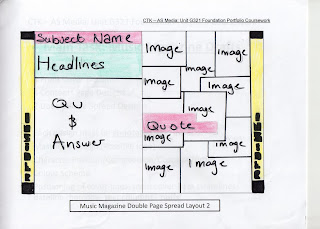
This is my final double page spread, with a quote added


In my second draft where i positioned my text would be right in the middle of where the page would fold. This would be a huge mistake if I left it. So i rearranged the text to the left-hand side. This meant i had to rearrange the montage also.


My second draft, everything was laid out, the way I wanted and i wrote up a question and answer and designed the title.


First Draft, i started to set out the layout, and arrange the images for a montage.

Friday, 4 November 2011

Main Task: Contents Page FINAL

This is my finished Contents page. I just has to add the final touches to this one since my last draft which was to just make it look neat.


This draft I made it look more simpler compared to the last draft by cutting down on the thick lines i used which made it look more messy. This draft was nearly complete, I just needed to neaten up the editors note, and the text for the features, add a page number, dateline and website link.


I kept to my colour scheme that was chosen by my target audience which is green, yellow and pink. I started to play about with different layout options.


This was the preferred design, so i started to work on this layout.


This was my first draft. I start working on the layout, adding the title and images. I then decided that i liked another draft better, that i had designed. So i decided to not carry on with this one and start another.

Thursday, 3 November 2011

Main Task: Front Cover FINAL

This is my final front cover. I added a different colour to some of the cover lines so that they don't all look the same.


I decided to remove some cover lines as it look too crowded and messy. I also changed to font size so they don't all look the same.


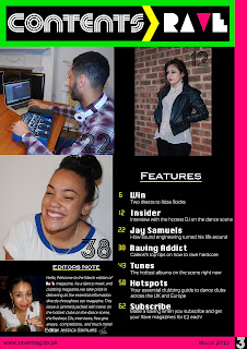
This is my second draft of my front cover, I moved my masthead to the centre as it didn't look right when it was to the left of the page. I also added all my cover lines.


Main Task: Unmanipulated Photos

UNUSED PHOTOS:
I have decided not to use this photograph because it is out of focus. This will not look good in a magazine because it wont look as sharp and clear as it should do making it look professional. I have decided to not use the second photo because i am unhappy with the composition. As you can see the wind blew her hair over her face which won't look good as it looks messy and unprofessional. I will not use the third photo either, because i don't like the lighting and it is very shadowy.


FRONT COVER IMAGE:
I have chosen to use this image as my front cover as i think her pose is very strong as she is looking directly at the camera. I have also chosen this image for my front cover as I think the brick wall in the background adds a textured, edgy effect. I think the photo looks very sharp and clear becausethe subject is in focus, which gives it a more professional look. I also think that the natural lighting in the photo looks good as it's not too bright.


POSSIBLE CONTENTS PAGE IMAGE:

I like the angle i took this picture at, as it is not dead on, but angle to the side of her. I also like her facial expression, as it looks very gentle, as she is not looking directly at the camera. I like the lighting in the picture as it is very natural. I also like this photo for a possible image on my contents page. I like it as it's a completely different pose to the front cover as she is crouching. I like this as you get to see the whole of her outfit, whilst showing the scenery around. I think this is also a strong image as she is in focus which makes the photo look very good.


MONTAGE OF IMAGES FOR DP SPREAD: For my double page spread I don't want to use just one image, i want to use a variety of photographs I took inspired by MixMag - Calvin Harris edition. As I am making a Dance magazine, it wouldn't be possible for me to take photos of Laurinda in a club, so I had an idea to do 'a day in the life of...' story. So I took a variety of photographs of what Laurinda would does when she is not DJ'ing or clubbing i.e. relaxing at home.


Main Task: FC, CP, DPS Mock Ups

Here are my designs for my music magazine, i have create 4 front cover designs, 4 contents page designs, and 2 double page spread designs.


Main Task: Case Study of a Publishing House


The publishing company that I am interested in is IPC Media. IPC media publish a numerous amount of well known magazines such In Style, Look, Marie Claire, NME, Nuts, and a variety of home, food, wine, gardening, sports, and TV magazine.


With such a variety of genres there are magazines targeted at numerous people, for instance Look magazine would be targeted at female around the age of 16-35. Or Nuts magazine, which is targeted at males roughly from the ages of 17 to 35. The home and garden magazine would be targeted at women from the age 40 and above. Where as magazines such as NME which is a indie/rock magazine would be targeted at majority young males from the age of 17 to 25. IPC target different audiences with each magazine they publish because a 25 year old man wouldn’t want to read Now magazine but would be more drawn to read Nuts magazine, and this is why they target specific audiences.

Main Task: Mood Board

Main Task: Profiling Your Audience


The RAVE reader: Holly-May, 24 is a hardcore raver, she is the type of girl everyone one will want to party with. Her lifestyle is influenced very much by her love for clubbing. Including her job, hobbies, friends and fashion.

Holly-May loves has a strong passion for music; she loves anything she can dance to. But her favorite type of music is dance, house, electronica and drum & bass. She has always had love dance music ever since she can remember. Her dad is a DJ, so Holly-May has grown up around music especially dance genre ever since she was a child. She grew up listening mainly to soulful house, one of her vivid memories was a family holiday to Brazil and going to a beach bar and partying all night long on the beach to house music. This holiday has had a massive impact on her life, as she wanted to relive that feeling she had when she was younger. Holly-May only started to get into electronica and drum & bass when she hit her teens, and rebelled to go out raving, she doesn’t regret any of it, in fact it had given her the drive to want to party all the time.

Holly-May can’t live without dance music, so this is why her profession as a club promoter fits in really well with her lifestyle. She had the opportunity to become a club promoter whilst out in Ibiza for 5 months, Holly-May grabbed at this opportunity with open arms and has been doing it for 3 years now, and still loves it.

Holly-May has traveled to many clubbing capitals to promote and to party such as Ibiza, London, Berlin, Miami, Tokyo, Singapore and Montreal. Holly-May is a very on the go girl and loves to keep busy.

Main Task: Audience Research


For my AS media coursework, I have to create my own music magazine. The genre I have chosen is dance/ club music. I would appreciate if you answer these questions for my audience research. Just write the question number followed by the letter of your chosen answer E.g. Q1) D

Thanks.

1. What attracts you to pick up and buy a music magazine
a) The image on the front of the mag b) The sub lines (the stories which will appear in that issue) c) The name of the magazine d) Freebies

2. In club/dance magazines what interests you the most? a) The double page spread relating to the front cover image b) Information on what the best clubs are and reviews c) The pictures d) The adverts

3. What do you like your music magazines to be like? a) Simplistic, plain and focusing on text b) Buzzing and energetic and full of images c) Neat and tidy but at the same time busy and eye catching

4.What is your favorite club/dance music magazine? a) DJ mag b) Mixmag c)iDJ d)Jockey Slut e)Muzik

5. What price are you willing to pay for a music magazine?
a) Nothing more than £2.50 b) Nothing more than £3.70 c) The price doesn’t matter if the magazine is worth it

6.What colour scheme do you think suits club/dance magazines best?
a) Black with florescent colours, green, yellow and pink b) Multicoloured a bit of everything c) Black and white

7. My music magazine will be called ‘RAVE’ which font do you think suits the theme of club dance the most?

1.
a)8
b)4
c)1
d)1

2.
a) 6 people
b) 8 people
c) none
d) none

3.
a) none
b) 3 people
c) 11 people

4.
a) 2 people
b) 3 people
c) 2 people
d) 1 person
e) 6 people

5.
a) 10 people
b) 2 people
c) 2 people

6.
a) 7
b) 6
c) 1

7.
a) 3 people
b) 1 person
c) 1 person
d) 3 people
e) 4people
f) 2 people
g) none

This research has helped me a lot, I now know what font I will use for my masthead, also I know what price i should used for my font cover. I also know what colour scheme i should use. From my audience research i will use their answers as a guide to designing my magazine as they will be my target audience.